
I had a base idea
for what I wanted my robot to look like, as you saw in my initial and developed
sketches. I started by getting the shape down and then worked on what I thought
the best colour scheme would be for the robot, I settled on silver and pink because
it’s a very bright and friendly colour scheme so that the robot wouldn't scare
people.
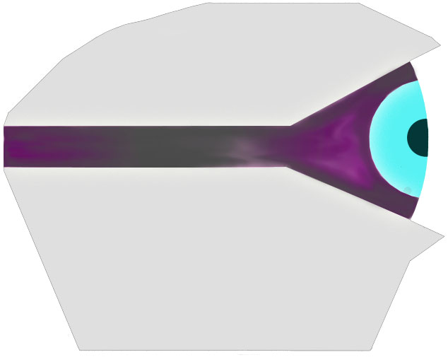
I then added the eye and toyed around with different colour for the light bar to see what it would look like if it took a darker effect. I feel like this didn't work as well I thought it might be. So I went back to pink.

I feel like the light blue eye works much better when coupled with the pink background because it stood out and makes it look bright and eye catching. I also darkened the metallic colour of the robot to make the eye and light bar look brighter and stand out more.

I then made the power bar light up, so that it looks better and contrasts against the darker metal.

After making the power bar light up, I added highlights and lowlights to add depth to the robot so that it looks more realistic. I also added some features such as the robots designation its and the light effects on the the robot.
I'm unhappy with my finished design because I know I could do better and the design is very simple with very little distinguishable features. Though I do feel that it will look very good as a 3D model but doesn't work so well as a 2D painting.
No comments:
Post a Comment